CASE STUDY · SERVICE MARKETPLACE
Led the End-to-End UX Revamped of a Service Marketplace
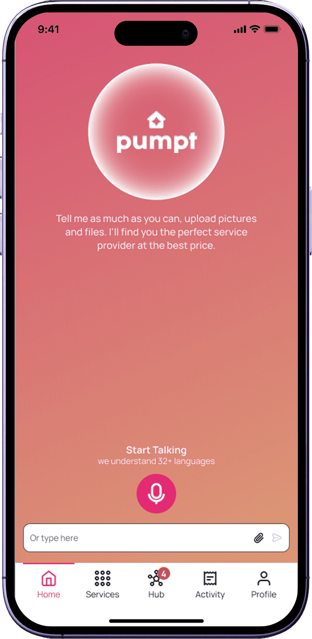
Pumpt is an AI-powered platform connecting homeowners and businesses with skilled tradespeople. I came in after a failed user test and turned it into a product worth shipping.
Role
UI/UX Designer
Scope
iOS • Android • Internal Tool Dashboard
Screens
200+


01 - PROJECT OVERVIEW
One platform, two very different users
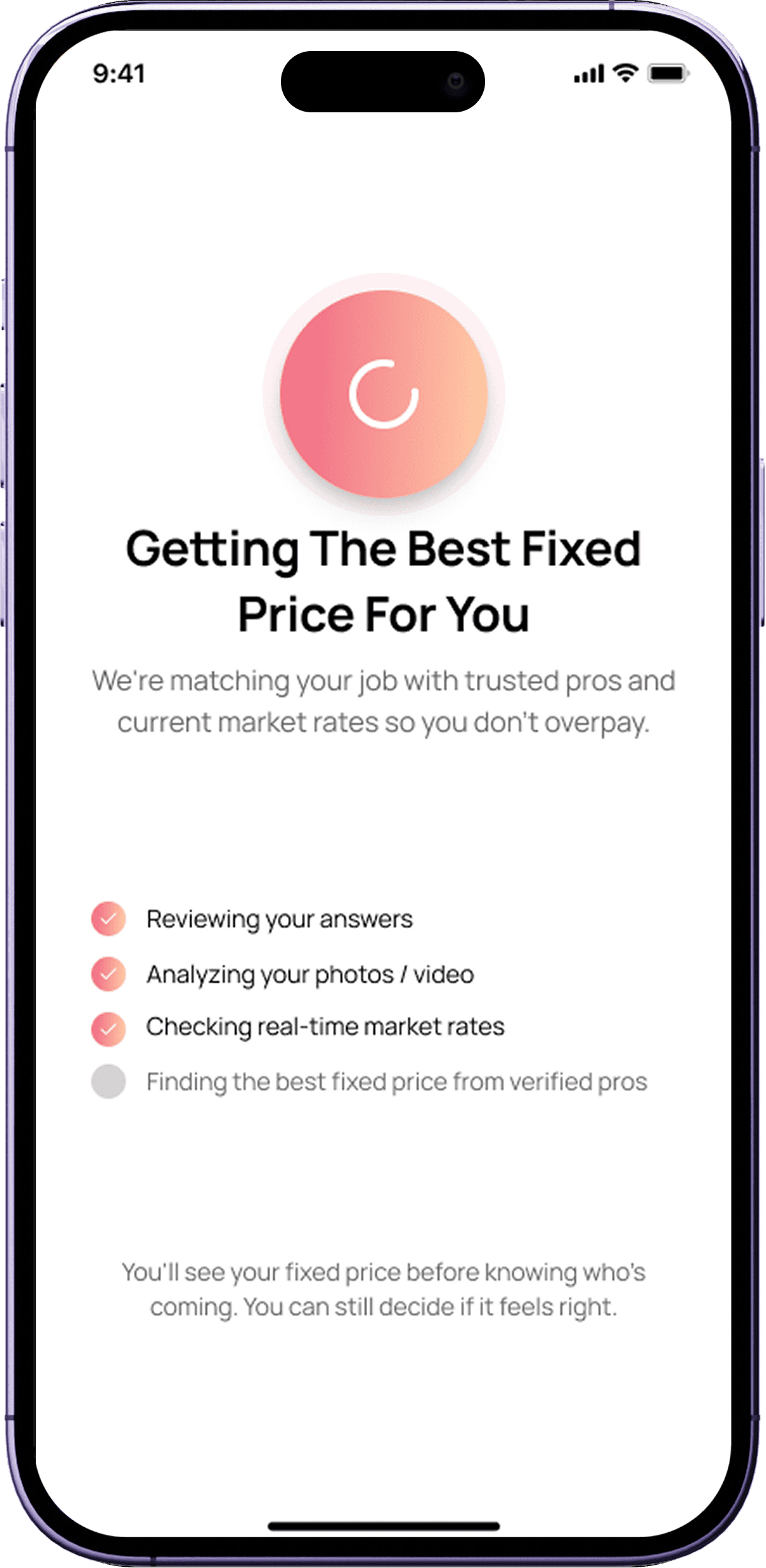
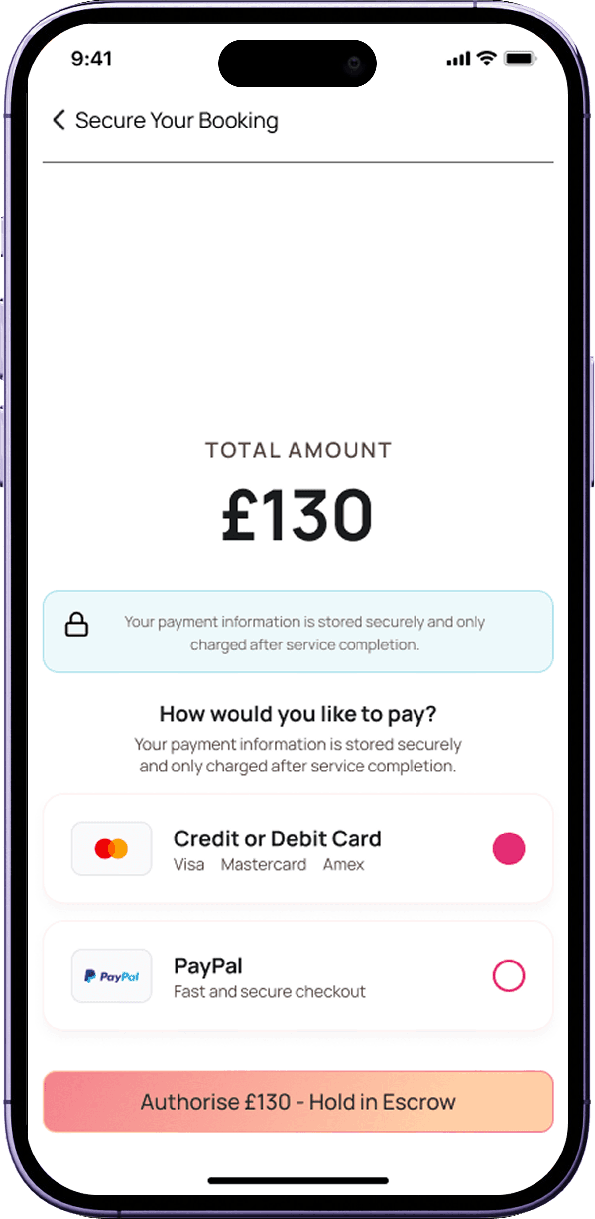
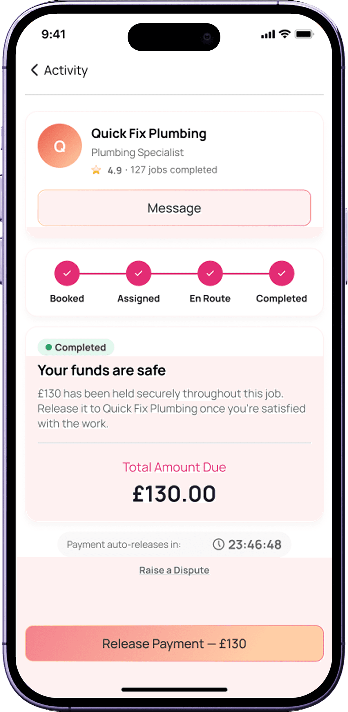
Pumpt connects homeowners and businesses with verified tradespeople through an AI-powered matching system. The platform handles the entire workflow — from job brief generation through to payment — eliminating the manual friction of traditional trades sourcing.
I designed both the Service Provider UI and the Customer UI, establishing a shared design system along the way. The project had no direct competitors to benchmark against, which made user research the primary compass for every design decision.
Service Providers (Pumpt Professionals)
Tradespeople receiving high-intent job requests without bidding wars or cold outreach.
Customers (Pumpt AI)
Tradespeople receiving high-intent job requests without bidding wars or cold outreach.
AI-powered matching
Three intelligent lanes based on job complexity, predictability, and scope route each request to the right professional.
2
Distinct user types designed for one shared platform
2-3
Features shipped per 2-week sprint cycle
0
Direct competitors, designed from first principles
3
AI tools used for rapid concept exploration
02 - THE PROBLEM
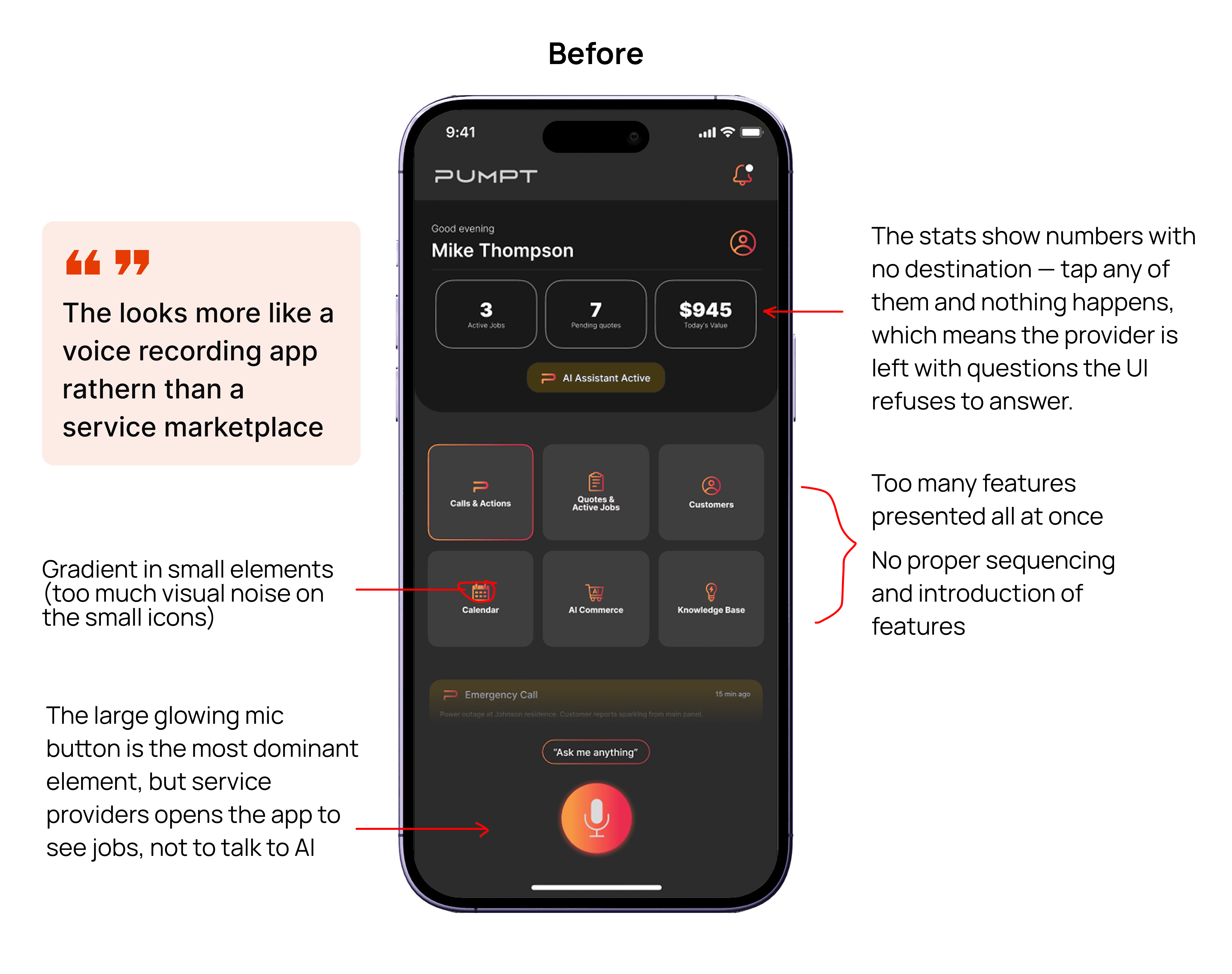
A UI that failed real users
The founder ran user testing before I joined. The results were clear — the original UI created confusion, not confidence. A new brand identity existed but had never been applied.
01
Navigation caused confusion
Providers couldn't find what they needed. The information hierarchy didn't reflect how tradespeople actually scan and prioritise job opportunities.
02
Unclear job request flows
The job acceptance flow had too many ambiguous states. Providers were unsure what actions were available and what each status actually meant.
03
Broken visual hierarchy
Critical information (job urgency, match quality, pay estimate) was visually buried. Users couldn't quickly assess whether a job was worth pursuing.
Before I Joined
Navigation caused confusion during testing
Job request flows felt unclear to providers
Visual hierarchy didn't reflect task priority
03 - DESIGN PROCESS
How I worked through it
No competitors. No reference library. Just user insights, a new brand, and a structured process to turn both into a product worth shipping.
01
Research synthesis — reading between the lines
Before touching any UI, I mapped friction points from the founder's user testing into actionable design decisions. With no direct competitors in the market, this research was my primary source of truth. I treated user feedback as design requirements — not suggestions.
02
Rapid concept exploration with AI tools
With zero direct market references, I used Lovable, Stitch, and Figma Make to rapidly explore UI patterns and interaction flows. I didn't commit to any single output — I extracted the strongest ideas from all three and synthesised them into a coherent direction. The AI tools were a divergence layer, not a shortcut.
03
Service Provider UI — applying insights and new brand
The Service Provider side was designed first — the higher-stakes half of the marketplace. Providers need clear job routing, structured briefs, and a frictionless acceptance flow. I applied the new brand palette and component approach consistently from screen one.
04
Iteration loop — present, filter, then act
I presented work to the founder, listened carefully to feedback, then made a deliberate call: does this serve the user's actual needs? If yes — I iterated. If a suggestion was preference over principle, I explained the reasoning and held the direction. This kept the product user-led, not opinion-led.
05
Customer UI — homeowners and businesses
With the Service Provider foundations solid, I designed the Customer-facing product (Pumpt AI). Homeowners and business operators have different job contexts — emergency versus planned maintenance — but needed a unified, confidence-building booking experience on the same platform.
06
Design system built screen by screen
As new screens were created, I documented repeatable components into a growing library. No big upfront investment — the system grew from the work itself. A component earned its place in the library when it appeared more than once across screens, keeping the system practical and grounded.
04 - DELIVERY RHYTHM
How we shipped consistently
A ticketing system and 2-week design sprints kept delivery predictable. 2–3 features per sprint — scoped, designed, handed off, and QA'd before release.
01 - Ticket scoping
Features scoped at the start of each sprint. Tickets defined the scope clearly before design exploration began.
2-week sprint
02 - Design + Figma
Screens designed in Figma — flows, states, edge cases. Designs shared early with dev, not at the finish line.
Shared Early
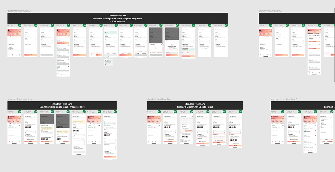
03 - Master File + Status
Completed features moved to the Master File with a clear status. Dev always knew what was ready to build.
Ready for Dev

04 - Design QA
Reviewed built features on staging before release — spacing, interactions, visual fidelity, responsive states.
Pre-release check
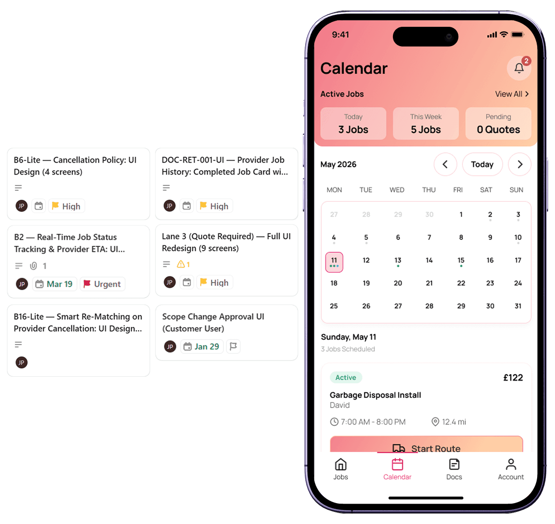
05 - SCREEN DESIGNS
Service Provider & Customer UI
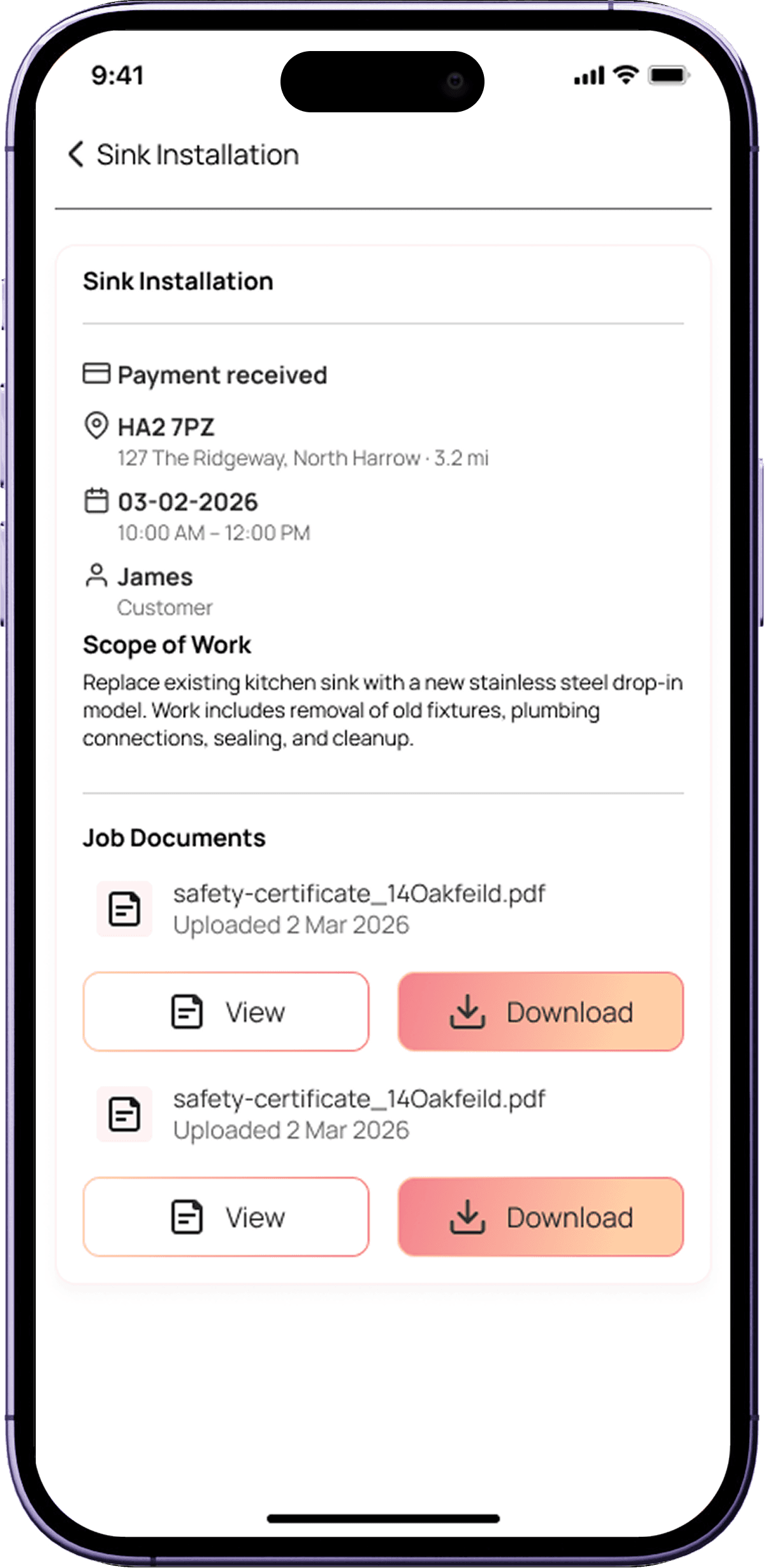
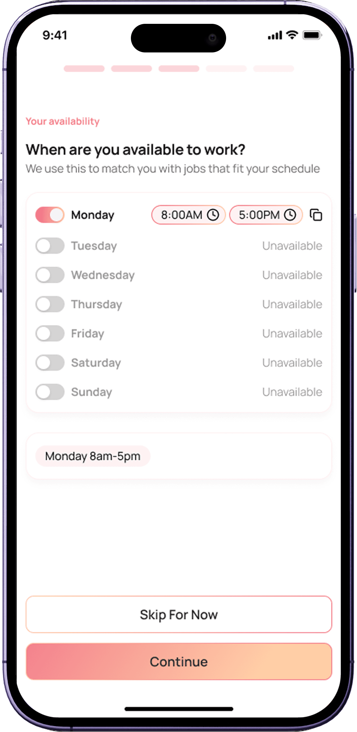
Two user types, one platform. Each side designed to reflect the distinct mental model of its user — while sharing a unified design language and component library.
Customer's UI
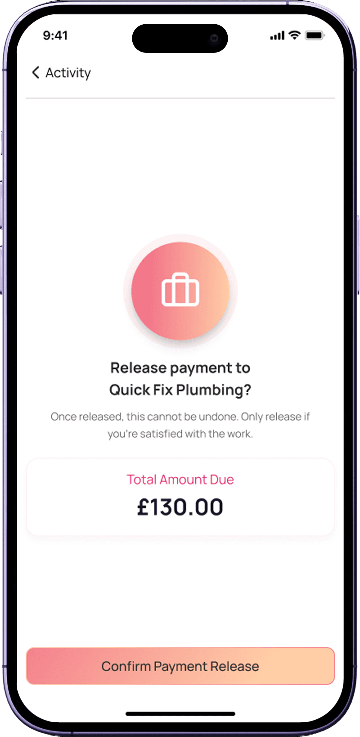
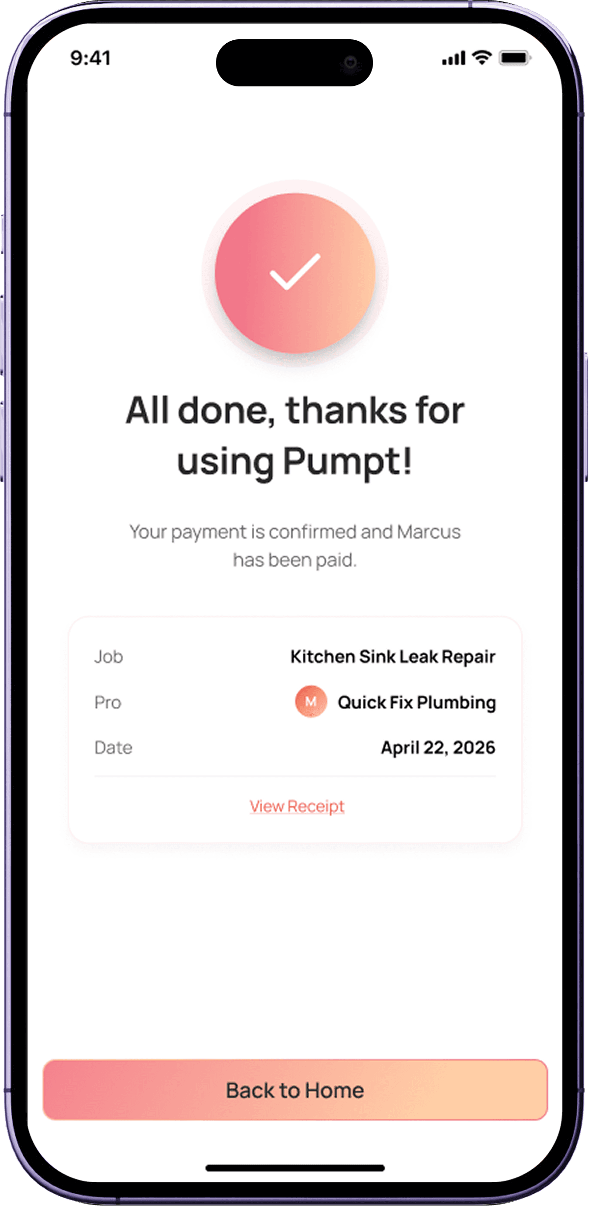
Service Provider's UI


06 - DESIGN SYSTEM
Built alongside delivery, not before it
The design system wasn't a separate workstream — it grew organically from the product work. Every time a component appeared in more than one screen, it got documented and added to the shared library.
01
Organic growth
Components were documented as they appeared — not designed speculatively. This kept the system grounded in real product needs.
02
Built collaboratively
The library was established together with the team — which meant developers understood it and used it correctly during implementation.
03
States documented for every component
Default, hover, active, disabled, error, loading — all captured so nothing was left to guesswork at handoff.
04
New brand applied as tokens.
The new colour palette and typography were implemented as design tokens from screen one, ensuring consistent application across both user types.

07 - TOOLS & APPROACH
AI-assisted exploration, human-led synthesis
With no competitors to reference, I used AI tools for rapid concept divergence — then synthesised the strongest ideas into a single coherent direction. The tools informed the work; they didn't do it.

Lovable
Used for rapid UI exploration across multiple layout directions simultaneously. Helped surface patterns quickly without committing to a single approach.
Divergence
Stitch
Explored interaction flows and component relationships. Useful for understanding how screens could connect before building in Figma.
Flow exploration

Figma Make
Generated component and layout variations quickly. Used alongside manual Figma work to expand the option space without slowing production down.
Rapid variation

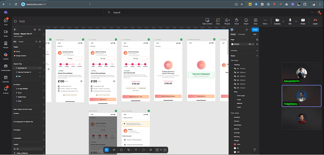
Figma
The primary production tool — all polished UI, component library, annotations, handoff specs, and Master File lived here.
Primary production

Ticketing system
Feature work scoped and tracked via tickets within 2-week design sprints. Kept delivery predictable and scope well-defined throughout.
Delivery tracking

User testing synthesis
The founder's pre-existing user testing results were my primary design compass — mapped into actionable decisions before any screen was touched.
Primary compass
08 - REFLECTION
What this project taught me
"With no direct competitors, I couldn't benchmark against existing patterns. That forced me back to first principles — what does each user type actually need to accomplish at every step?"
The no-competition constraint turned out to be one of the most valuable constraints I've worked under. It eliminated the temptation to copy-paste from market leaders and forced genuine problem-solving grounded in real user evidence.
The AI exploration tools (Lovable, Stitch, Figma Make) played an important supporting role — not as a replacement for design thinking, but as a way to expand the option space quickly when there was nothing obvious to draw from. The synthesis step — deciding what to keep, combine, and discard — was where the actual design work happened.
User research as primary compass
When there's no market reference, user feedback becomes the north star. I treated testing insights as requirements, not inspiration.
The feedback filter matters
Not all feedback is equal. Assessing founder input against actual user needs — before implementing — kept the product user-led through every iteration.
Systems thinking from day one
Building the component library incrementally alongside delivery was more effective than planning it upfront. The system earned each component from real usage.
Design and dev are one team
Sharing early, annotating thoroughly, and running QA on staging — these habits built trust with engineering and meant fewer surprises at release.
LET’S TALK
You've seen how I think
Now let's build something
Whether you're hiring, collaborating, or just want to talk design — I'm open to the conversation. I work best with people who care about the thinking behind the pixels, not just the pixels themselves.
Get in Touch
I’m Jason Piano, a UI/UX Designer with 4+ years of experience. I design interfaces that don’t just look good, they reduce friction, guide decisions, and support business goals.
Follow me at
Jason Piano. All rights reserved. 2026
Let's Work Together!
itsjasonpiano@gmail.com