CASE STUDY · JANE APP
Redesigning Sign-Up for Jane App
A 4-step onboarding overhaul that reduced cognitive load, surfaced pricing transparency, and introduced a first-of-its-kind review step — turning a leaky funnel into a confident conversion path.
Role
UI/UX Designer
Scope
UX Audit & UI Redesign
THE PROTOTYPE
01 — PROBLEM
A flow designed to lose customers
Auditing the original signup experience revealed a pattern: each step created a new reason for a user to abandon. The flow was built for completion, not confidence — and health professionals signing up for a $79–$99/mo subscription need to feel confident.
High Dropout
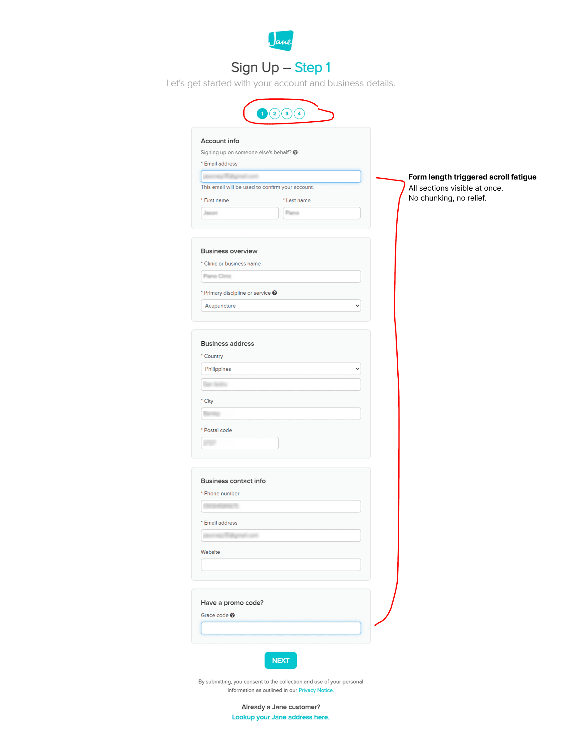
Step 1 dumps everything at once
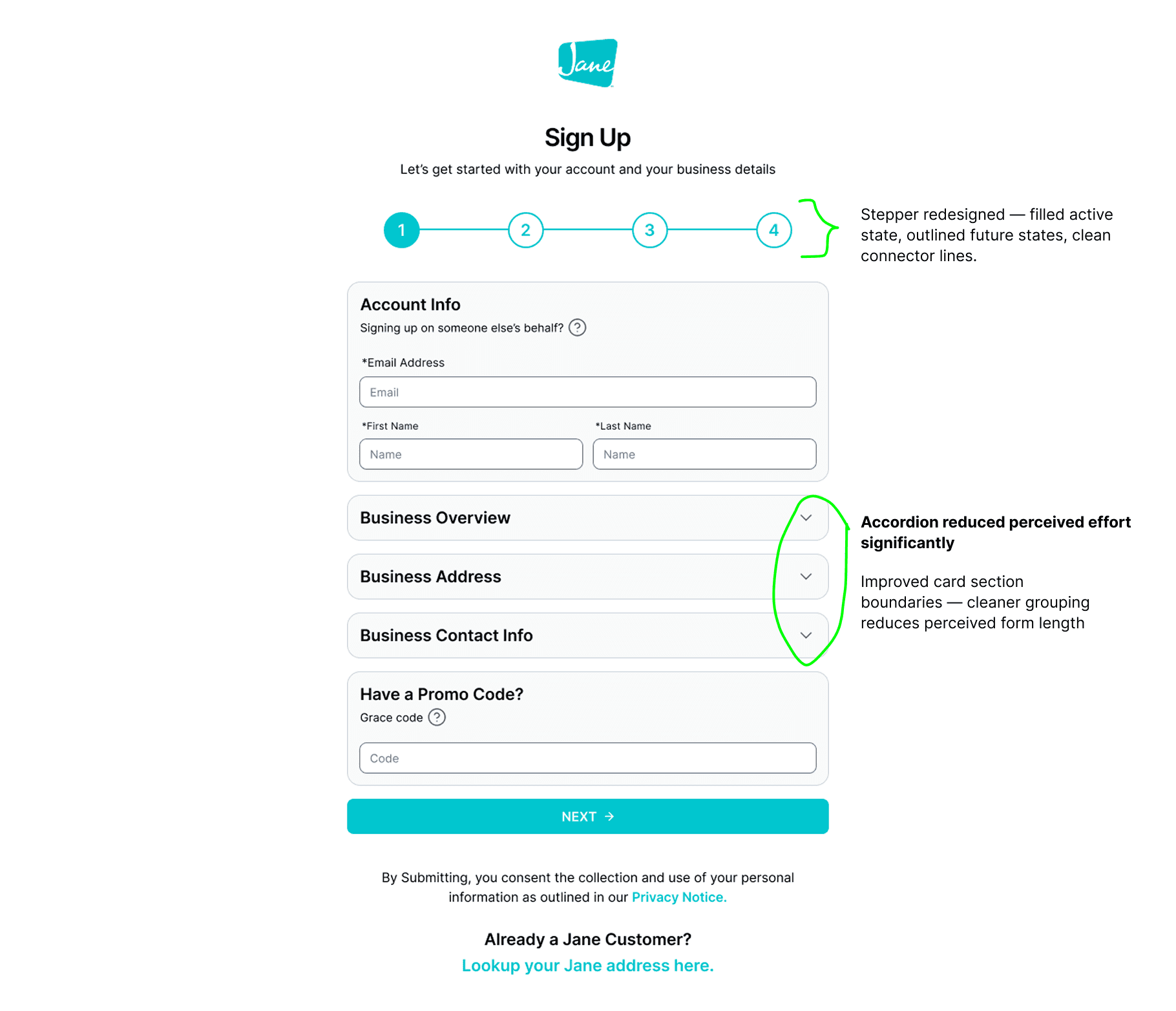
Five sections — account, business, address, contact, promo — before any sense of progress. Cognitive overload before a single keystroke.
User Frustration
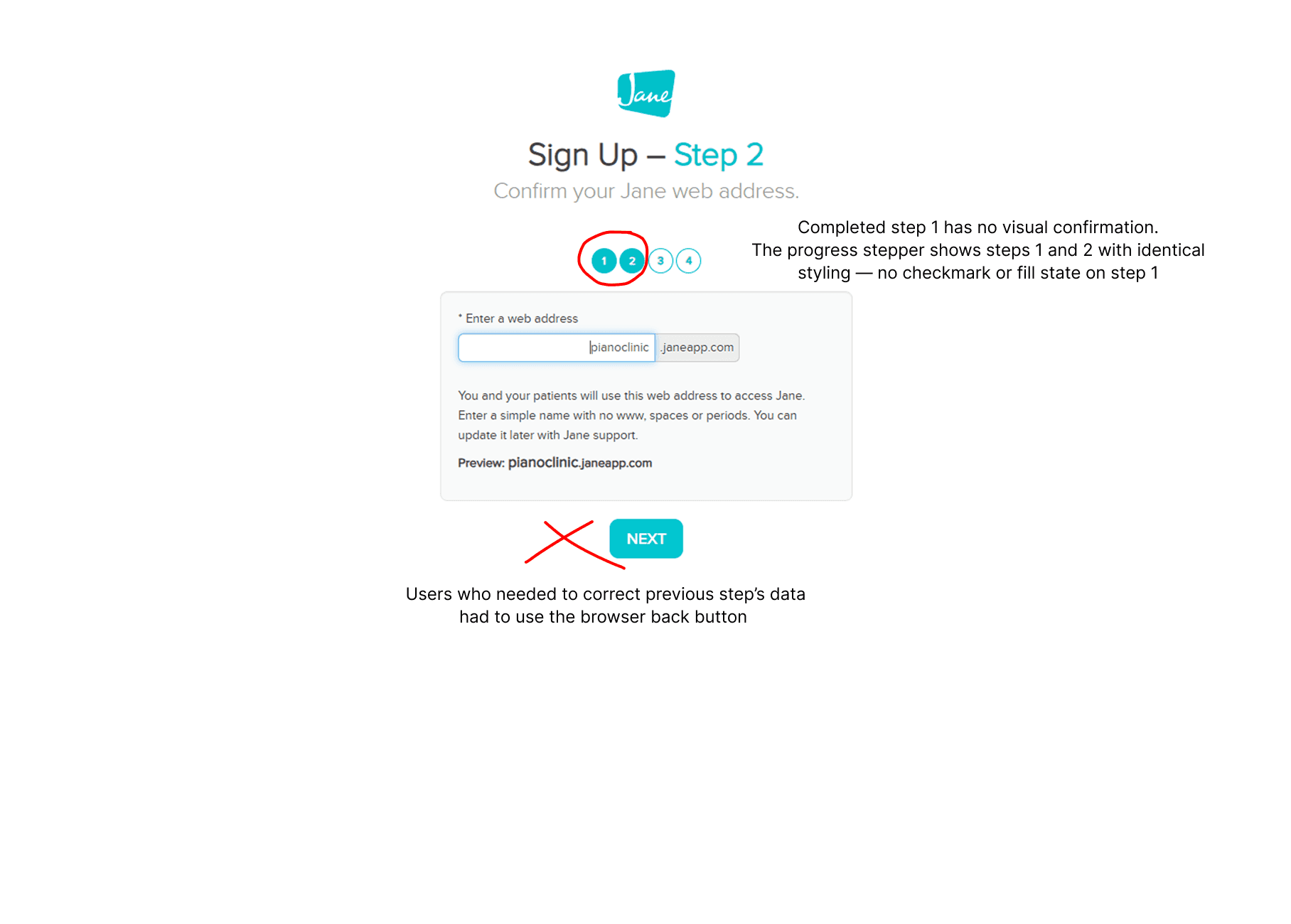
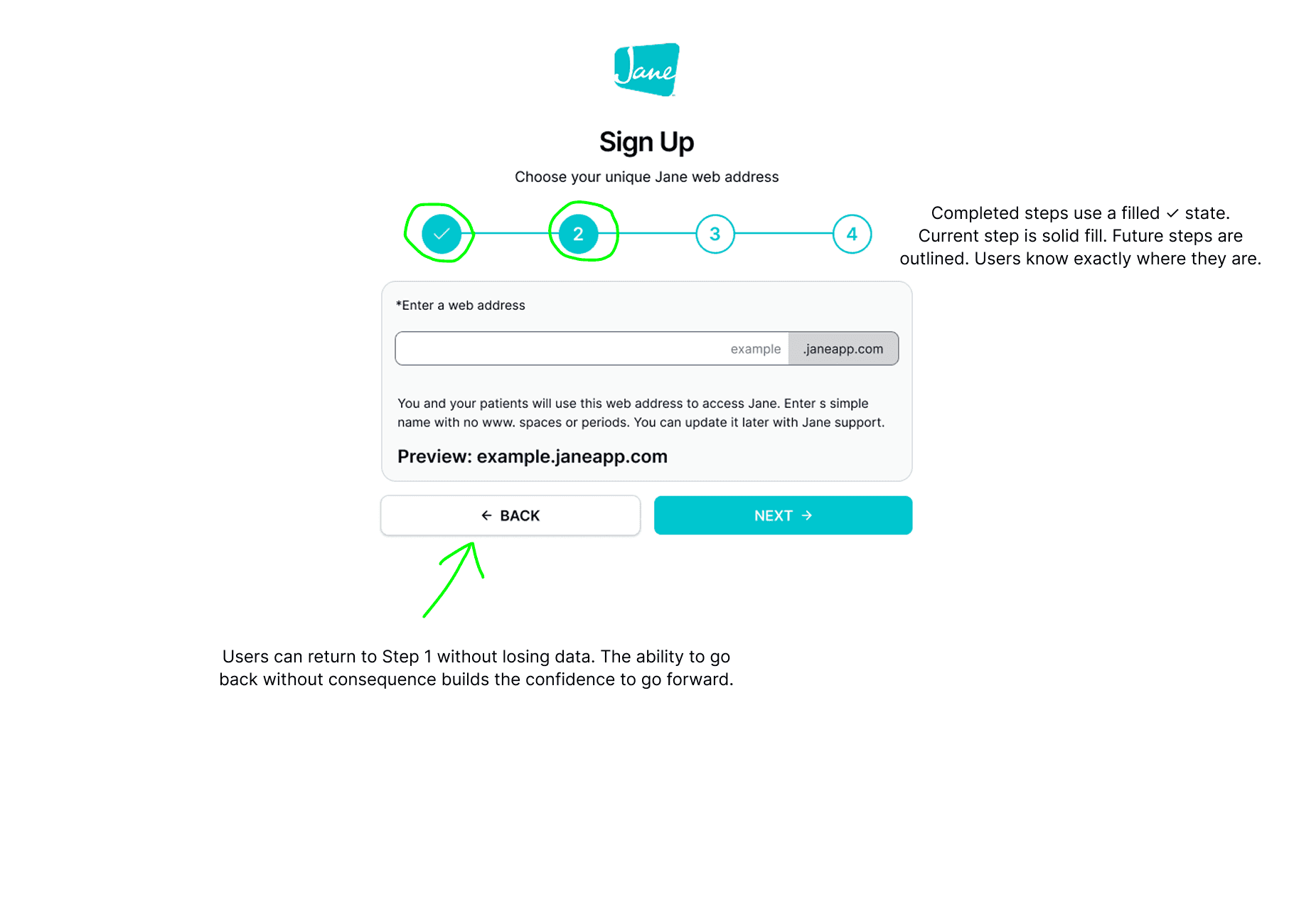
No Back button on Step 2
Users who spotted errors in Step 1 had no way back. Forcing browser back destroys form state and trust simultaneously.
Orientation Failure
Progress indicator has no completed state
Completed and current steps looked identical. Users couldn't tell where they'd been or how much remained.
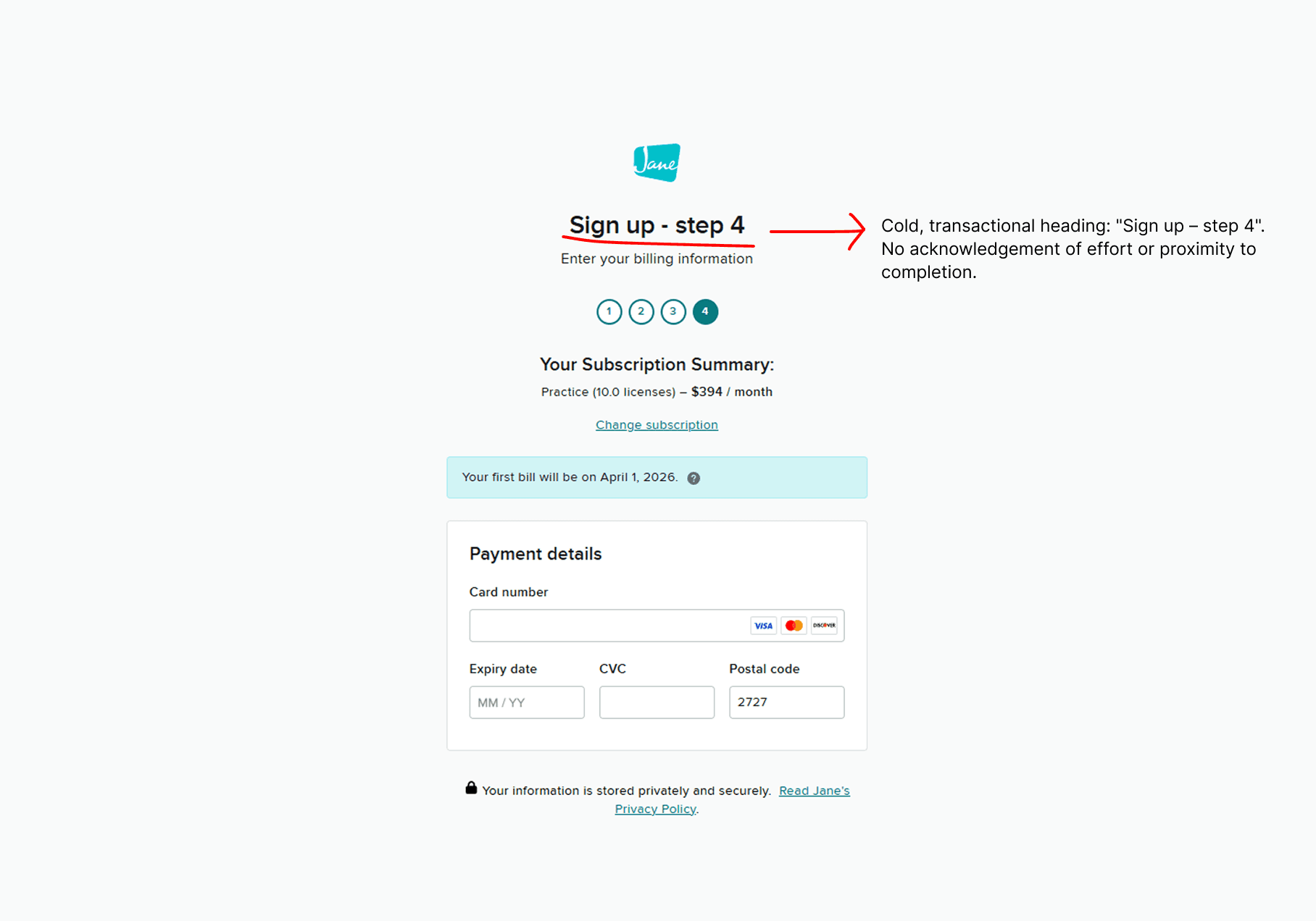
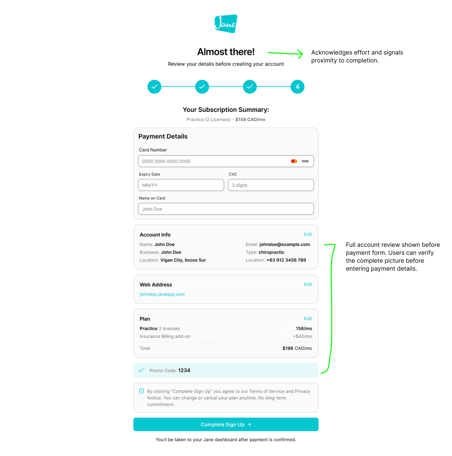
Payment Abandonment
No review screen before payment
Step 4 jumped directly to credit card entry — no account summary, no plan confirmation, no promo verification.
Plan Indecision
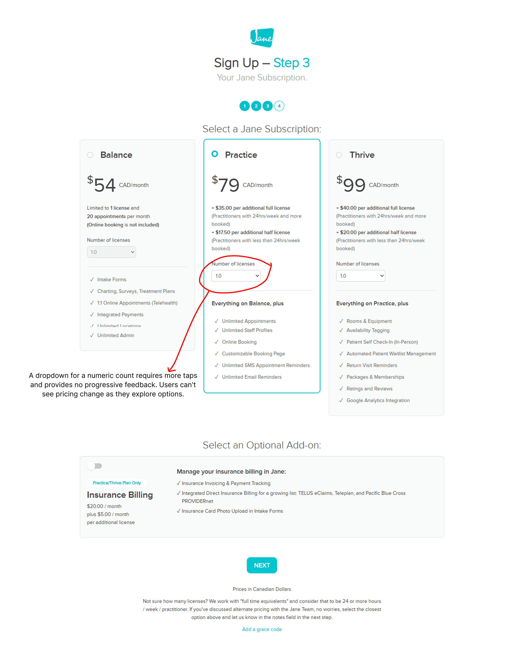
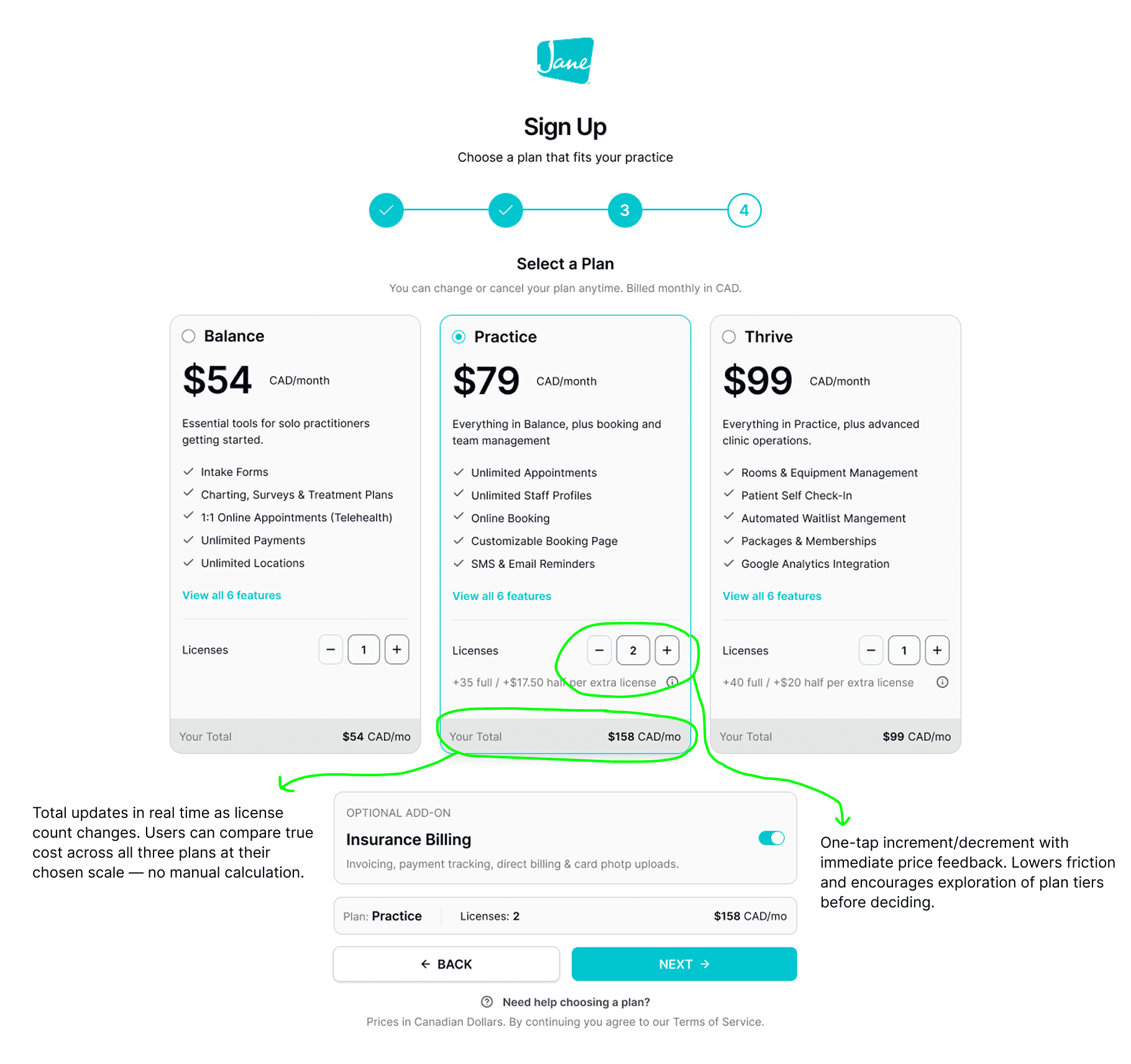
Dropdown for license count
Selecting a numeric count via dropdown made pricing exploration slow. No real-time total meant manual cost calculation.
03 — THE PROCESS
An AI-augmented workflow from brief to tested prototype
An AI-augmented process — not to replace design judgment, but to accelerate exploration and compress the path from idea to validated prototype.
Used Claude AI to write UI generation prompts
Fed the problem list and design goals into Claude to generate detailed, structured UI prompts — specific enough to produce coherent designs across three different AI generation tools. The brief became a reusable generation spec.
Claude AI
Prompt engineering
UI generation spec
Generated UI explorations across 3 AI tools
The same Claude-written prompt was run through three AI tools — each producing a distinct interpretation. Outputs were compared against the design goals, not aesthetic preferences.
Lovable
Google Stitch
Figma Make
Built & published a live prototype via Figma Make → Figma Sites
Used Figma Make to generate a functional prototype from the final branded screens. Published via Figma Sites to produce a live, shareable URL ready for testing — without a single line of hand-written code.
Figma Make
Figma Sites
Fast turnaround
Ran prototype usability testing on main flows via TestMu AI
The Figma Sites live URL was fed into TestMu AI to run structured usability test suites across the main flows — golden path completion, optional field variants, accordion interaction edge cases, and full A11y keyboard + screen reader coverage. 4 suites, 14 test cases executed systematically.
TestMu AI
Prototype usability testing
Main Flows
Iterated until major usability issues were resolved
Testing surfaced one failing test and one edge case requiring attention. The failing negative test — missing validation on the empty web address field — was treated as a blocker. The design was updated to add an inline error state, then re-tested to confirm the fix resolved the issue before moving forward. Minor issues were logged and deprioritised. Iteration continued until no major usability issues remained.
Test → Identify → Fix → Re-test → Clear
Prepared the design file for development
With major usability issues resolved, the Figma file was prepared for engineering handoff. This included organising layers and frames by flow and step, applying consistent component naming, ensuring all design tokens were mapped to the existing design system, and verifying that interactive states (default, hover, error, disabled) were present and named for every component.
File organisation
Dev handoff
04 — BEFORE/AFTER
A flow designed to lose customers
Auditing the original signup experience revealed a pattern: each step created a new reason for a user to abandon. The flow was built for completion, not confidence — and health professionals signing up for a $79–$99/mo subscription need to feel confident.
05 — USABILITY TESTING & ITERATION
Testing the prototype, then fixing what it found
The Figma Sites live prototype was run through TestMu AI across the main flows — not as a sign-off step, but as an iteration driver. Results were triaged by severity: blockers fixed immediately and re-tested, edge cases logged and monitored.
TestMu AI→Live Figma Sites prototype
12
Tests passed
1
Blocker fixed
1
Edge monitored
14
Total cases
Golden Path — Successfully Complete Step 1
Validates the happy path for the first step of the sign-up flow.
1 Positive | 0 Negative | 0 Edge case · Monitor
Golden Path Variant — Optional Fields + Step 2: Web Address
ests optional field omission and web address configuration, including data persistence on back navigation.
3 Positive
1 Negative
Edge Case — Accordion UI Interaction and State
Validates the behavior of the accordion sections (Business Overview, Address, Contact Info) in Step 1.
3 Positive
1 Edge case · Monitor
A11y — Keyboard Navigation and Screen Reader Support
Verifies Step 1 sign-up form is fully accessible via keyboard and assistive technology.
5 Positive | 0 Negative | 0 Edge case · Monitor
06 - KEY LEARNINGS
What this project and workflow reinforced
01
Goals before generation — always
Running AI tools without a clear brief produces fast noise. Writing concrete goals first and using them as the evaluation lens turned three different AI outputs into a structured comparison, not a beauty contest.
02
AI accelerates exploration; judgment selects direction
None of the three AI-generated UIs was used wholesale. The designer's role shifted from producing screens to critically evaluating them — which requires stronger, not weaker, design fundamentals.
03
Design system application is where craft lives
AI tools generate layouts. Applying the Jane design system correctly — tokens, component states, spacing rhythm — is where work becomes a real product. That step required human precision and couldn't be shortcut.
04
AI testing caught a real bug before anyone else did
The missing validation message on the empty URL field was caught by the TestMu negative test — before any human QA pass. AI-assisted testing shines here: systematic coverage of scenarios a designer wouldn't retest manually every iteration.
LET’S TALK
You've seen how I think
Now let's build something
Whether you're hiring, collaborating, or just want to talk design — I'm open to the conversation. I work best with people who care about the thinking behind the pixels, not just the pixels themselves.
Get in Touch
I’m Jason Piano, a UI/UX Designer with 4+ years of experience. I design interfaces that don’t just look good, they reduce friction, guide decisions, and support business goals.
Follow me at
Jason Piano. All rights reserved. 2026
Let's Work Together!
itsjasonpiano@gmail.com