CASE STUDY · DESIGN SYSTEM · 2025
Building a scalable design system for a two-sided service marketplace
A full product revamp — UX overhaul, visual direction, and design system architecture for Pumpt, an AI-native platform connecting homeowners, business owners, and service providers.
Role
UI/UX Designer
Scope
Mobile · Admin · Design System
Stage
Pre-launch startup

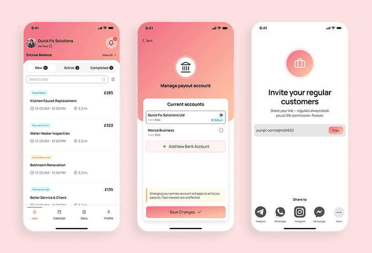


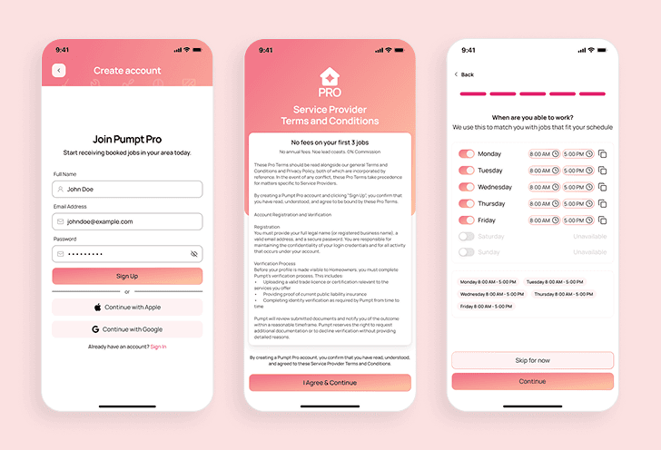
01 — OVERVIEW
Not a new product. A better one.
When I hopped in with this project, the product had already been designed. A previous designer had built screens, sketched components beside those screens, and shipped a visual direction. But it had never launched.
Before anything could go to market, there were two parallel problems to solve. The first was a UX problem: inconsistent experiences, broken visual hierarchy, unhandled edge cases, and user flows that generated real confusion in testing. The second — more foundational — was a design system problem: there was no true design system at all.
My mandate was to fix both. Not by tweaking the surface, but by rebuilding from the foundation up. This is a case study about how I did that and what I learned along the way.

02 — THE PROBLEM
Two problems, one deadline
The existing product had compounding issues at two layers. The UX was inconsistent — weak visual hierarchy, missing edge case handling, and flows that created more confusion than they resolved. But underneath the UX problem was a structural one: there was no real design system to fix it with.
The previous designer created components manually beside screens. No complete variants. No documentation. No usage guidelines. No token structure. What existed wasn't a system — it was a collection of one-off shapes that happened to look similar.

03 — DISCOVERY
Understanding before designing
Before opening Figma, I invested time in understanding the business: what was the product trying to solve, what had the founder communicated to early users, and what did the existing research reveal about where people were getting stuck.
The startup had conducted user testing prior to my engagement. My role at this stage wasn't to generate new insights from scratch — it was to synthesize what was already known, identify where the redesign priorities should land, and validate those priorities against both user feedback and business goals.
04 — UX AUDIT
Evaluating what already existed — objectively
A UX audit isn't about criticism for its own sake. It's about building a shared, documented understanding of where the product fails users — and using that evidence to justify every redesign decision.

"It looks more like a voice recording app than a service marketplace."
That feedback from an early user captured the core visual hierarchy failure. The largest, most dominant element on the provider home screen was a glowing microphone button — an AI input. But service providers open the app to see their jobs, not to talk to an AI assistant. The most prominent thing on the screen communicated the wrong priority entirely.
05 — VISUAL DIRECTION
Alignment before design execution
Before touching components or screens, I facilitated a moodboarding workshop with stakeholders
This isn't just about being collaborative. It's about risk reduction. When stakeholders participate in defining the direction, the risk of late-stage visual rejections drops significantly.

The Moodboard

Their Preference
The founders were particularly attached to the coral-to-magenta gradient from their pitch deck. That wasn't a constraint to work around — it was useful signal. It told me exactly what the brand wanted to feel like. My job was to make that gradient work systematically, not fight it.

06 — DESIGN FOUNDATIONS
Extracting primitives from the brand
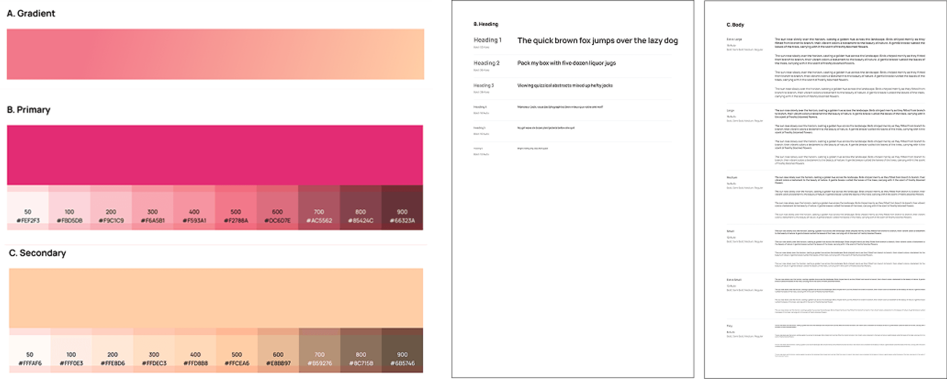
To ensure the product reflected the brand — and not just any clean, modern aesthetic — I extracted the visual foundations directly from the company's existing pitch deck. That document was the most resolved artifact of the brand's visual identity, and it gave me reliable primitives to build from.
07 — DESIGN SYSTEM STRATEGY
The strategic decision that changed everything
Once the visual direction was approved and the primitive tokens were established, I faced the core strategic question of the project: how do you build a production-ready component library for a startup with aggressive timelines and limited resources?
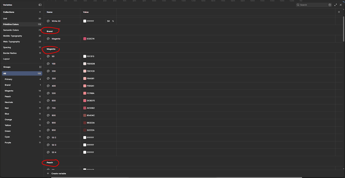
Instead of building every component from scratch, I evaluated established design systems and selected ShadCN as the foundation. The reasoning was straightforward: ShadCN offered a proven component architecture, a large reusable library, strong developer familiarity, and reduced implementation risk. The startup needed to move fast and scale — building from zero would have been the slower path.



What "building on ShadCN" actually meant
Using ShadCN as a foundation didn't mean shipping ShadCN as-is. It meant using its architecture as the scaffolding, then rebuilding every token and modifying every component to match Pumpt's brand, platform needs, and usage patterns.
The brand's magenta was added as a primitive color and threaded through the semantic layer as the primary action color. The default ShadCN typography was replaced with the Pumpt type scale. Then every component — buttons, inputs, navigation elements, feedback states — was modified to carry the new identity consistently across mobile and admin contexts.
Primitive Layer
Raw values — magenta scale, peach scale, type scale, spacing
Semantic Layer
Intent — primary, secondary, danger, success, neutral, brand
Component Layer
Components consuming semantic tokens — consistent, rebrandable
07 — COMPONENT ARCHITECTURE
Built to expand, not just to cover the current scope
The component library wasn't built only for what Pumpt needed today. It was architected for what the platform would eventually need: a web application, more surface types, more user roles, more complex states. Every component needed to flex before new ones needed to be created.

08 — IMPACT
Operational impact over vanity metrics
Because the product had not yet launched when the redesign was completed, traditional product metrics — engagement rates, task completion, retention — were not available. This is an honest limitation I won't paper over with proxies.
What I can speak to is operational impact: the concrete change in how design and development work happened after the system was in place.
UI consistency across mobile and admin surfaces, without requiring manual cross-checking between files
Faster screen creation through reusable, well-documented components — new screens could be assembled rather than rebuilt
Predictable developer handoff — components documented with states, variants, and usage guidance reduced ambiguity in implementation
Token architecture made future rebranding or theming a system-level change — not a file-by-file one
A single source of truth that any future designer or developer could onboard into without tribal knowledge
09 — KEY LEARNINGS
What this project reinforced
01
Primitives first, always
The temptation to skip straight to components is real, especially under timeline pressure. But primitives are the contract. Every component built before the token system is agreed on is a component that may need to be rebuilt. The short-term slowness of establishing foundations is always faster than the long-term cost of not having them.
02
Stakeholder buy-in through co-creation
The moodboarding session wasn't just a creative exercise. It was a risk mitigation strategy. When stakeholders participate in defining the visual direction, you're not presenting them with a decision — you're formalizing one they've already made with you. Late-stage visual rejections become far less likely.
03
Adapting existing systems beats building from scratch
Choosing ShadCN as a foundation wasn't a shortcut — it was a strategic decision. Startups don't have the runway to build component libraries the way mature design organizations do. Understanding when to build and when to adapt is one of the most important judgment calls a senior designer can make.
04
Documentation is the product
A component without documentation is a design decision that only the person who made it can explain. Documentation converts individual knowledge into organizational knowledge. In a startup that will grow, this matters more than the components themselves.
LET’S TALK
You've seen how I think
Now let's build something
Whether you're hiring, collaborating, or just want to talk design — I'm open to the conversation. I work best with people who care about the thinking behind the pixels, not just the pixels themselves.
Get in Touch
I’m Jason Piano, a UI/UX Designer with 4+ years of experience. I design interfaces that don’t just look good, they reduce friction, guide decisions, and support business goals.
Follow me at
Jason Piano. All rights reserved. 2026
Let's Work Together!
itsjasonpiano@gmail.com